OpenHAB - SmartHome (346 posts)
-
23/07/2026
OPENHAB 5: Garden Automation: Stop Mosquitoes - VIDEO -
12/07/2026
OPENHAB 5 & SMARTTHINGS: Complete Webhooks Integration - VIDEO -
03/07/2026
I couldn't enable Webhooks on SmartThings... then I did this. Let's start with SmartApps - VIDEO -
22/05/2026
OPENHAB 5: with the new SAMSUNG fridge I decided to update my SMARTTHINGS integration - VIDEO -
20/04/2026
OPENHAB in a NUTSHELL: 64. CONSOLE - Log Management - VIDEO -
27/03/2026
OPENHAB in a NUTSHELL: 63. CONSOLE - The OPENHAB Engine - Bundles and Features (Karaf) - VIDEO -
19/03/2026
OPENHAB in a NUTSHELL: 62. CONSOLE - We manage ITEMS, THINGS and LINKS using KARAF CONSOLE - VIDEO -
11/03/2026
OPENHAB in a NUTSHELL: 61. DOCKER and the CONSOLE - Easy access even without the openhab-cli command - VIDEO -
05/03/2026
OPENHAB in a NUTSHELL: 60. The Console - From Theory to Practice - Access, Cheats, and Runtime Commands - VIDEO -
27/02/2026
OPENHAB in a NUTSHELL: 59. The Console - Enter the Engine Room! An Introduction to Apache Karaf - VIDEO -
22/02/2026
OpenHAB 5: XIAOMI Cloud Login Error? Here's how to fix it (Bypass) - VIDEO -
27/01/2026
OpenHAB 5 & Matter: Goodbye Cloud! SwitchBot Lock Pro and Hub Mini Integration - VIDEO -
23/01/2026
OpenHAB and GOOGLE AI: Integrating Gemini AI into OpenHAB: Complete Guide with AI2MQTT! - VIDEO -
17/01/2026
OpenHAB 5: I installed the 5.1 update - I BROKE EVERYTHING but then I fixed it! - VIDEO -
20/12/2025
OpenHAB and AI: Full Gemini Integration with AI2MQTT Script and MQTT Protocol - VIDEO -
07/12/2025
OpenHAB and AI: I connected Gemini to OpenHAB with Python and MQTT - VIDEO -
27/11/2025
OpenHAB and AI: how to Integrate the Gemini API into openHAB - The Secret to JSON Responses - VIDEO -
16/11/2025
OPENHAB 5: complete monitoring of the matter bridge status (items, rules, and notifications) - VIDEO -
12/11/2025
OPENHAB 5: Never lose the status of your Matter Bridge again! | Automatic notifications with OpenHAB - VIDEO -
10/11/2025
OPENHAB 5: How to retrieve Matter Bridge status when starting OpenHAB | Simple and automatic solution - VIDEO -
28/10/2025
OPENHAB 5: Is my Matter Bridge running? Here's how I monitored it from OpenHAB! - VIDEO -
21/10/2025
OPENHAB 5: Setting up the Matter Bridge - the best way to connect Google Home and Alexa - VIDEO -
16/10/2025
OPENHAB 5: Connect your Shelly without CLOUD with MQTT – simple and fast! - VIDEO -
09/10/2025
OPENHAB 5: How to Configure the MATTER Client in Minutes and Integrate Devices Step-by-Step - VIDEO -
06/10/2025
OPENHAB 5 + MATTER: The Royalty-Free Standard That Unifies Home Automation - VIDEO -
24/09/2025
OPENHAB 5 + MATTER Bridge: How to pair the same device multiple times (it really WORKS!) - VIDEO -
23/09/2025
OPENHAB 5: Configuring the Matter Bridge in openHAB 5 with the Main UI - VIDEO -
16/09/2025
OPENHAB 5: The MATTER Bridge is SO COOL! - VIDEO -
13/09/2025
OPENHAB 5: What's new? New features, improvements, and enhancements for smart home automation - VIDEO -
04/09/2025
OPENHAB: Upgrading to OpenHAB 5.0.1: my experience, from small mistakes to big satisfaction - VIDEO -
02/09/2025
OPENHAB: I finally updated to version 5 - VIDEO -
07/08/2025
OPENHAB: SwitchBot API-MQTT Bridge - Finally it's (almost) complete! - VIDEO -
02/07/2025
WEBHOOK: What They Are, How They Work, and When to Use Them in Home Automation - VIDEO -
19/06/2025
OPENHAB: SwitchBot API-MQTT Bridge - Now Supports ALL Devices on OpenHAB! - VIDEO -
10/06/2025
OPENHAB: I finally completed the configuration of the Switchbot Smart Lock ... and it works !!!! - VIDEO -
06/06/2025
OPENHAB: integrating my SWITCHBOT SMART LOCK using my API2MQTT BRIDGE - VIDEO -
03/06/2025
OPENHAB: Switchbot Smartlock, easy integration with the first draft of my bridge API MQTT written in python - VIDEO -
28/05/2025
OPENHAB: Introduction to SWITCHBOT SMARTLOCK / API and MQTT integration - VIDEO -
05/05/2025
OPENHAB 5: I use Docker Compose to easily create and manage the container - VIDEO -
27/04/2025
OPENHAB 5: I'm updating my test DOCKER container to the newly released Milestone 2 version 5 - VIDEO -
17/04/2025
OPENHAB 5: I restore my OPENHAB 4 current configuration - VIDEO -
12/04/2025
OPENHAB 5: I install the Milestone 1 version on DOCKER to test it together with OPENHAB 4 - VIDEO -
08/04/2025
OPENHAB 5: The time has come!!! - VIDEO -
02/04/2025
OPENHAB 4 - I made my interface SMARTER with a visual notification for not updated data - VIDEO -
25/03/2025
OPENHAB 4 - An OpenHAB update ruined my DASHBOARD???? - VIDEO -
16/03/2025
OPENHAB in a NUTSHELL - 58. My complete BACKUP script for OPENHAB 4 and INFLUXDB 2 on DOCKER - VIDEO -
13/03/2025
OPENHAB in a NUTSHELL - 57. How to restore a BACKUP on DOCKER containers...and not only - VIDEO -
10/03/2025
OPENHAB in a NUTSHELL - 56. OpenHAB as Container DOCKER? Here's how to do a BACKUP correctly - VIDEO -
06/03/2025
OPENHAB in a NUTSHELL - 55. Protect your SMARTHOME, perform a complete OPENHAB BACKUP! - VIDEO -
02/03/2025
OPENHAB in a NUTSHELL - 54. I used SHELL commands to update DOCKER CONTAINER - VIDEO -
26/02/2025
OPENHAB in a NUTSHELL - 53. Update openHAB as DOCKER CONTAINER with PORTAINER and notes for WINDOWS - VIDEO -
24/02/2025
OPENHAB in a NUTSHELL - 52. From LINUX updates to OpenHAB: system always at TOP - VIDEO -
18/02/2025
OPENHAB in a NUTSHELL - 51. Create your PERSONAL WIDGET for OPENHAB from scratch - Tutorial - VIDEO -
11/02/2025
OPENHAB 4 - I added animations and dynamic icons to my ENERGY WIDGET - VIDEO -
08/02/2025
OPENHAB 4 - ENERGY WIDGET, I shared my first draft on GITHUB - VIDEO -
05/02/2025
OPENHAB 4 - ENERGY WIDGET Preview, my first personal WIDGET - VIDEO -
03/02/2025
OPENHAB in a NUTSHELL: 50. Manage Your Smart Home with Custom Widgets - VIDEO Tutorial -
01/02/2025
OPENHAB and GOOGLE AI - I get help from GEMINI to create a rule - Funny VIDEO -
29/01/2025
OPENHAB in a NUTSHELL: 49. Customize Your OpenHAB UI: A Guide to Layouts and CSS - VIDEO -
27/01/2025
OPENHAB in a NUTSHELL: 48. UI PAGES Structure - Components and Widgets - VIDEO -
24/01/2025
OPENHAB 4 and SAMSUNG Air Conditioners: let's setup THINGS, CHANNELS and ITEMS using HTTP binding - VIDEO -
22/01/2025
OPENHAB 4: SmartThings API in Action to Integrate SAMSUNG Air Conditioners into OpenHAB - VIDEO -
21/01/2025
OPENHAB 4: How I integrated my SAMSUNG air conditioners with SMARTTHINGS APIs - VIDEO -
18/01/2025
OPENHAB 5 Update: Configuration with Text File on DOCKER - Interesting Results - VIDEO -
16/01/2025
I installed the brand new OPENHAB 5.0 with DOCKER on Raspberry PI 4 - VIDEO -
14/01/2025
OPENHAB 4: Unlock the Full Potential of Interactive Background Pt 2 - Tutorial - New in OpenHAB 4.3 - VIDEO -
12/01/2025
OPENHAB 4: Unlock the Full Potential of Interactive Background Pt 1 - Tutorial - New in OpenHAB 4.3 - VIDEO -
08/01/2025
OPENHAB 4: New in version 4.3 - create FLOORPLAN pages using INTERACTIVE SVG Backgrounds - VIDEO -
06/01/2025
OPENHAB 4: Mastering OpenHAB Logs: New Features and Enhancements in 4.3 version - VIDEO -
03/01/2025
OPENHAB 4: VERSION 4.3 is here. Must-Have UPGRADE! Find Out Why - VIDEO -
26/12/2024
OPENHAB in a NUTSHELL: 47. FIXED LAYOUT PAGES - The best UI for wall-mounted panel - VIDEO -
20/12/2024
OPENHAB in a NUTSHELL: 46. RESPONSIVE LAYOUT Part 2 - Automatic arrangement of widgets - VIDEO -
18/12/2024
OPENHAB in a NUTSHELL: 45. RESPONSIVE LAYOUT Part 1 - How to design a single UI for every device - VIDEO -
15/12/2024
OPENHAB in a NUTSHELL: 44. Introduction to LAYOUT PAGES , the ULTIMATE USER INTERFACE for OPENHAB - VIDEO -
10/12/2024
OPENHAB in a NUTSHELL: 43. CHART PAGE Part 2 - Let's make CHARTS better on OPENHAB - VIDEO -
04/12/2024
OPENHAB in a NUTSHELL: 42. CHART PAGE Part 1 - Bring your SMARTHOME data to life with CHARTS! - VIDEO -
27/11/2024
OPENHAB in a NUTSHELL: 41. TABBED PAGE - Organize your Smarthome efficiently - Complete guide - VIDEO -
24/11/2024
OPENHAB in a NUTSHELL: 40. Design your SMART HOME with FLOORPLANS - Complete guide - VIDEO -
20/11/2024
OPENHAB in a NUTSHELL: 39. Level up your SMART HOME with maps - a step-by-step GUIDE - VIDEO -
18/11/2024
OPENHAB in a NUTSHELL: 38. Remote Access using CLOUD - I can control my SMART HOME everywhere - VIDEO -
16/11/2024
OPENHAB 4: I make my RAIN and TWILIGHT sensors work with TASMOTA, SONOFF and INFLUXDB - VIDEO -
12/11/2024
OPENHAB 4: ICLOUD binding and IPAD BATTERY. Now it's WORKING - VIDEO -
10/11/2024
OPENHAB in a NUTSHELL: 37. SITEMAP Part 8 - I install OPENHAB on ANDROID to use SITEMAPs - VIDEO -
06/11/2024
OPENHAB in a NUTSHELL: 36. SITEMAP Part 7 - I make my interface MULTIMEDIA - VIDEO -
04/11/2024
OPENHAB in a NUTSHELL: 35. SITEMAP Part 6 - More WIDGETS for my pages - VIDEO -
02/11/2024
OPENHAB in a NUTSHELL: 34. SITEMAP Part 5 - Easy buttons with BUTTONGRID - VIDEO -
31/10/2024
OPENHAB in a NUTSHELL: 33. SITEMAP Part 4 - Many WIDGET to design your UI - VIDEO -
29/10/2024
OPENHAB 4: Why did ICLOUD binding suddenly stop working on OPENHAB? - VIDEO -
25/10/2024
OPENHAB in a NUTSHELL: 32. SITEMAP Part 3 - Playing with COLOR and ICONS thanks to dynamic properties - VIDEO -
23/10/2024
OPENHAB in a NUTSHELL: 31. SITEMAP Part 2 - I'll reveal a gems to you: DYNAMIC VISIBILITY - VIDEO -
21/10/2024
OPENHAB 4: Part 2 - Integrating my Light and Rain Sensors with MQTT and TASMOTA - VIDEO -
19/10/2024
OPENHAB 4: Part 1 - Integrating my Light and Rain Sensors with MQTT and TASMOTA - VIDEO -
16/10/2024
OPENHAB 4: Read analog sensor data (light, rain) with TASMOTA, SONOFF 4CH and ADS1115 - VIDEO -
15/10/2024
OPENHAB 4: I tested the LIGHT sensor and the RAIN sensor with SONOFF 4CH and TASMOTA - VIDEO -
12/10/2024
OPENHAB 4: IPAD as control panel - I need battery status - VIDEO -
08/10/2024
OPENHAB in a NUTSHELL: 30. SITEMAP Part 1 - Everything you need to know - VIDEO -
06/10/2024
OPENHAB 4: LIGHT and RAIN sensor, connected to a SONOFF 4 CH with TASMOTA firmware - Preview - VIDEO -
03/10/2024
OPENHAB in a NUTSHELL: 29. User interface introduction - VIDEO -
29/09/2024
OPENHAB 4: INFLUXDB v. 2 64 bit - Checking TASKS - VIDEO -
24/09/2024
OPENHAB 4: INFLUXDB v. 2 64 bit - My first FLUX TASK to manage historical data - VIDEO -
20/09/2024
OPENHAB 4: Post Upgrade Test for INFLUXDB v. 2 on RASPBERRY PI 4 with 64 bit OS - VIDEO -
17/09/2024
OPENHAB 4: INFLUXDB upgrade from v. 1.8 to v. 2 on RASPBERRY PI 4 with 64 bit OS - VIDEO -
12/09/2024
OPENHAB 4: INFLUXDB v. 2 on RASPBERRY PI 4 - Test with OPENHAB and GRAFANA - VIDEO -
10/09/2024
OPENHAB 4: INFLUXDB 2 on RASPBERRY PI 4 with 64 BIT OpenHabian OS as a DOCKER container - VIDEO -
04/08/2024
OPENHAB 4: UI2FILES software updated - VIDEO -
01/08/2024
OPENHAB 4: Some problems with TIMEZONE? RESOLVED!!! - VIDEO -
30/07/2024
OPENHAB in a NUTSHELL: 28. MQTT: Installation of MOSQUITTO BROKER as DOCKER CONTAINER - VIDEO -
19/07/2024
OPENHAB 4: migrate configuration from MainUI to Files - I'm almost done with my software!!! - VIDEO -
12/07/2024
OPENHAB in a NUTSHELL: 27. MQTT: Installation of MOSQUITTO BROKER on OPENHABIAN / LINUX - VIDEO -
07/07/2024
OPENHAB 4: Migrate configuration from MainUI to Files - Automatic Tool - VIDEO -
02/07/2024
OPENHAB in a NUTSHELL: 26. MQTT: Installation of MOSQUITTO BROKER on WINDOWS - VIDEO -
27/06/2024
OPENHAB in a NUTSHELL: 25. MQTT: What and Why - VIDEO -
20/06/2024
OPENHAB and SWIMMING POOL control panel: working prototype - VIDEO -
14/06/2024
OPENHAB in a NUTSHELL: 24. Devices integration - XIAOMI Binding - VIDEO -
10/06/2024
OPENHAB in a NUTSHELL: 23. Devices integration - MQTT Protocol - VIDEO -
07/06/2024
OPENHAB in a NUTSHELL: 22. Devices integration - Type of BINDINGS - VIDEO -
29/05/2024
OPENHAB and SWIMMING POOL control panel: calibrating PH meter 4502C - VIDEO -
25/05/2024
OPENHAB and SWIMMING POOL control panel: testing PH meter 4502C - VIDEO -
21/05/2024
OPENHAB in a NUTSHELL: 21. The SEMANTIC MODEL - Refactoring... - VIDEO -
17/05/2024
OPENHAB in a NUTSHELL: 20. The SEMANTIC MODEL - Starting from scratch - VIDEO -
14/05/2024
OPENHAB in a NUTSHELL: 19. The SEMANTIC MODEL - Theory - VIDEO -
01/05/2024
OPENHAB in a NUTSHELL: 18. TAGS - The basis of SEMANTIC modeling - VIDEO -
23/04/2024
OPENHAB in a NUTSHELL: 17. Groups - The basis of SEMANTIC modeling - VIDEO -
16/04/2024
OPENHAB in a NUTSHELL: 16. PERSISTENCE check and examples - VIDEO -
11/04/2024
OPENHAB in a NUTSHELL: 15. Introduction to PERSISTENCE - VIDEO -
04/04/2024
OPENHAB in a NUTSHELL: 14. Tips & Tricks for designing using Main UI - VIDEO -
30/03/2024
OPENHAB in a NUTSHELL: 13. Some considerations on design methods - VIDEO -
29/03/2024
OPENHAB 4: Manual installation for LG THINQ binding, used for LG appliances - VIDEO -
26/03/2024
OPENHAB in a NUTSHELL: 12. Design in practice with TEXT FILES - VIDEO -
22/03/2024
OPENHAB in a NUTSHELL: 11. Design in practice with MAIN UI - VIDEO -
19/03/2024
OPENHAB in a NUTSHELL: 10. Things, Channels, Items - Design theory - VIDEO -
14/03/2024
OPENHAB and BITCOIN: what do Cryptocurrencies have to do with Home Automation ??? - VIDEO -
10/03/2024
OPENHAB in a NUTSHELL: 9. How to change OpenHAB version??? - VIDEO -
06/03/2024
OPENHAB in a NUTSHELL: 8. OpenHABian - Initial configuration completed - VIDEO -
04/03/2024
OPENHAB in a NUTSHELL: 7. OpenHABian - Initial configuration (Part 1) - VIDEO -
27/02/2024
SHELLY 2 PM PLUS - Native and Local MQTT connection for OPENHAB - VIDEO -
26/02/2024
OPENHAB in a NUTSHELL: 6. PORTAINER installation on Raspberry PI - VIDEO -
21/02/2024
OPENHAB in a NUTSHELL: 5. DOCKER CONTAINER and OPENHAB - VIDEO -
19/02/2024
OPENHAB 4 WIDGET. A beautiful WEATHER station - VIDEO -
13/02/2024
OPENHAB in a NUTSHELL: 4. OpenHAB installation on WINDOWS - VIDEO -
09/02/2024
OPENHAB in a NUTSHELL: 3. OpenHAB installation on LINUX (deb) - VIDEO -
07/02/2024
OPENHAB in a NUTSHELL: 2. First type of SETUP with OpenHABian - VIDEO -
04/02/2024
OPENHAB in a NUTSHELL: 1.Choosing runtime environment - VIDEO -
31/01/2024
OPENHAB in a NUTSHELL: 0.Introduction - from THEORY to PRACTICE - VIDEO -
30/01/2024
OpenHAB - News on Youtube Channel and a brand new project - Video - Home Automation System -
24/01/2024
OpenHAB 4 - Contextual Help, very useful feature - Video - Home Automation System -
16/01/2024
OpenHAB 4 - Smart TV SAMSUNG, how will my integration end? - Video - Home Automation System -
14/01/2024
OpenHAB 4 - SMARTTHINGS API, HTTP Binding, GET/POST call with JSON payload - Home Automation System -
10/01/2024
OpenHAB 4 - Trying SMARTTHINGS API to integrate my SAMSUNG SMART TV - Home Automation System -
06/01/2024
OpenHAB 4 - Identifying TABLET usage to improve the DASHBOARD - Home Automation System -
03/01/2024
OpenHAB 4 - DASHBOARD with FLOORPLAN page changing automatically - Home Automation System -
28/12/2023
OpenHAB 4 - I tried the new feature 'UI Command Item' - Home Automation System -
22/12/2023
OpenHAB 4 - I tried the SAMSUNG TV BETA Binding - Home Automation System -
16/12/2023
OpenHAB 4 - SAMSUNG SMART TV Integration - Home Automation System -
06/12/2023
OpenHAB 4 - Final test for INFLUXDB 2.7 on WINDOWS with OPENHAB - Home Automation System -
02/12/2023
OpenHAB 4 - Testing INFLUXDB 2.7 on WINDOWS with GRAFANA - Home Automation System -
23/11/2023
OpenHAB 4 - Upgrade to INFLUXDB 2.7 on WINDOWS with DOCKER - Home Automation System -
17/11/2023
OpenHAB 4 - Upgrade to INFLUXDB 2.7, change of program - Home Automation System -
12/11/2023
OpenHAB 4 - Testing upgrade to INFLUXDB 2.7 using a docker container - Home Automation System -
08/11/2023
OpenHAB 4 - INFLUXDB Update from 1.8 to 2.7 - Home Automation System -
02/11/2023
OpenHAB 4 - Problem solving after upgrade from OPENHAB 3 - Home Automation System -
27/10/2023
OpenHAB 4 - Upgrade from OpenHAB 3 - Home Automation System -
18/10/2023
OpenHAB 3 - Swimming pool control panel with SONOFF and TASMOTA - SITEMAP and TEST - Home Automation System -
13/10/2023
OpenHAB 3 - Swimming pool control panel with SONOFF and TASMOTA - The rules - Home Automation System -
05/10/2023
OpenHAB 3 - Swimming pool control panel with SONOFF and TASMOTA Step 1 - Home Automation System -
28/05/2023
OpenHAB 4 - Inline upgrade to Java 17 and OpenHAB 4 M3 on WINDOWS - Home Automation System -
09/05/2023
OpenHAB 4 - Inline upgrade to Java 17 and OpenHAB 4 M2 - Home Automation System -
19/04/2023
OpenHAB 4 - Data migration from OpenHAB 3 with Docker - Home Automation System -
29/03/2023
OpenHAB 4 - Testing new version with DOCKER - Home Automation System -
13/03/2023
OpenHAB 4 - New Version Release - Home Automation System -
18/02/2023
OpenHAB 3 - WINDOWS release UPDATE - Home Automation System -
15/01/2023
OpenHAB 3 - WINDOWS setup - Home Automation System -
11/12/2022
OpenHAB 3 - SMART Christmas tree 2022 - Home Automation System -
15/10/2022
OpenHAB 3 - Example for rules triggers by DateTime item - Part 3 - Home Automation System -
09/10/2022
OpenHAB 3 - Example for rules triggers by DateTime item - Part 2 - Home Automation System -
01/10/2022
OpenHAB 3 - Example for rules triggers by DateTime item - Part 1 - Home Automation System -
27/06/2022
OpenHAB 3 - Rules triggers by DateTime item - Home Automation System -
23/06/2022
OpenHAB 3 - Widgets for Android - Home Automation System -
11/06/2022
OpenHAB 3 - Create new page with YAML source code - Home Automation System -
04/06/2022
OpenHAB 3 - TABLET - Alarm details page - Home Automation System -
31/05/2022
OpenHAB 3 - Real use case for alarm notification - Home Automation System -
23/05/2022
OpenHAB 3 - FLOORPLAN page for garden - Home Automation System -
15/05/2022
Home Automation System - OpenHAB 3 - Grafana dashboard update -
07/05/2022
Home Automation System - OpenHAB 3 Migration - 52. System Info in OpenHAB - Monitoring rules -
30/04/2022
Home Automation System - OpenHAB 3 Migration - 52. System Info in OpenHAB - UI -
23/04/2022
Home Automation System - OpenHAB 3 Migration - 52. System Info in OpenHAB -
18/04/2022
Home Automation System - OpenHAB 3 Migration - 51. Tablet autorecharge with HabPanelViewer, openHAB and Sonoff -
09/04/2022
Home Automation System - OpenHAB 3 Migration - 50. HabPanelViewer configuration for OpenHAB -
02/04/2022
Home Automation System - OpenHAB 3 Migration - 49. HabPanelViewer setup on Android tablet -
26/03/2022
Home Automation System - OpenHAB 3 Migration - 48. OpenHAB control panel on tablet -
19/03/2022
Home Automation System - OpenHAB 3 Migration - 47. Let's create a Floorplan page step by step Part 2 -
14/03/2022
Home Automation System - OpenHAB 3 Migration - 47. Let's create a Floorplan page step by step Part 1 -
07/03/2022
Home Automation System - OpenHAB 3 Migration - 46. My first Floorplan example -
27/02/2022
Home Automation System - OpenHAB 3 Migration - 45. Speedtest integration in OpenHAB Part 2 -
25/02/2022
Home Automation System - OpenHAB 3 Migration - 45. Speedtest integration in OpenHAB -
17/02/2022
Home Automation System - OpenHAB 3 Migration - 44. Tasmota Buttons Multipress -
10/02/2022
Home Automation System - An article from our partner IQS - Industrial Quick Search -
07/02/2022
Home Automation System - OpenHAB 3 Migration - 43. Auto reconnection to OpenHab Cloud -
21/01/2022
Home Automation System - OpenHAB 3 Migration - 42. My Grafana Dashboards -
05/01/2022
Home Automation System - OpenHAB 3 Migration - 41. Grafana Dashboards -
26/12/2021
Home Automation System - OpenHAB 3 Migration - 40. OpenHAB and InfluxDB (docker) backup procedure -
22/12/2021
Home Automation System - OpenHAB 3 Migration - 39. Current status and next steps -
14/12/2021
Home Automation System - OpenHAB 3 Migration - 38. SMART Christmas tree -
07/12/2021
Home Automation System - OpenHAB 3 Migration - 37. XIAOMI VACUUM robot commands -
27/11/2021
Home Automation System - OpenHAB 3 Migration - 36. XIAOMI Robot maintenance check -
23/11/2021
Home Automation System - OpenHAB 3 Migration - 35. Last update items check -
11/11/2021
Home Automation System - OpenHAB 3 Migration - 34. Energy consumption ALARM and MONITOR -
06/11/2021
Home Automation System - OpenHAB 3 Migration - 33. Energy consumption and photovoltaic production -
02/11/2021
Home Automation System - OpenHAB 3 Migration - 32. Gas Alarm and Google Home Pt 2 -
30/10/2021
Home Automation System - OpenHAB 3 Migration - 32. Gas Alarm and Google Home Pt 1 -
25/10/2021
Home Automation System - OpenHAB 3 Migration - 31. Google Home as OpenHAB speaker -
21/10/2021
Home Automation System - OpenHAB 3 Migration - 30. Amazon Alexa Integration Part2 -
18/10/2021
Home Automation System - OpenHAB 3 Migration - 30. Amazon Alexa Integration Part1 -
15/10/2021
Home Automation System - OpenHAB 3 Migration - 29. Google Home Integration -
12/10/2021
Home Automation System - OpenHAB 3 Migration - 28. ESP8266 Wifi Repeater -
09/10/2021
Home Automation System - OpenHAB 3 Migration - 27. ESP8266 and Tasmota light sensor Part 2 -
05/10/2021
Home Automation System - OpenHAB 3 Migration - 27. ESP8266 and Tasmota light sensor Part 1 -
29/09/2021
Home Automation System - OpenHAB 3 Migration - 26. Custom ESP8266 with a MQ-4 gas sensor Part 2 -
25/09/2021
Home Automation System - OpenHAB 3 Migration - 26. Custom ESP8266 with a MQ-4 gas sensor Part 1 -
22/09/2021
Home Automation System - OpenHAB 3 Migration - 25. Xiaomi Mi Robot Vacuum integration Part 2 -
15/09/2021
Home Automation System - OpenHAB 3 Migration - 25. Xiaomi Mi Robot Vacuum integration Part 1 -
10/09/2021
Home Automation System - OpenHAB 3 Migration - 24. Xiaomi Yeelight RGB Lamp Part 3 -
07/09/2021
Home Automation System - OpenHAB 3 Migration - 24. Xiaomi Yeelight RGB Lamp Part 2 -
01/09/2021
Home Automation System - OpenHAB 3 Migration - 24. Xiaomi Yeelight RGB Lamp Part 1 -
24/08/2021
Home Automation System - OpenHAB 3 Migration - 23. Groups to manage InfluxDB persistence -
18/08/2021
Home Automation System - OpenHAB 3 Migration - 22. Functional model -
12/08/2021
Home Automation System - OpenHAB 3 Migration - 21. OpenHAB 3.1 Stable Update -
09/08/2021
Home Automation System - OpenHAB 3 Migration - 20. Wifi Info Sonoff Tasmota with MQTT Part 2 -
05/08/2021
Home Automation System - OpenHAB 3 Migration - 20. Wifi Info Sonoff Tasmota with MQTT -
31/07/2021
Home Automation System - OpenHAB 3 Migration - 19. Sonoff 4ch textual definition Part 2 -
26/07/2021
Home Automation System - OpenHAB 3 Migration - 19. Sonoff 4ch with Tasmota - textual definition -
23/07/2021
Home Automation System - OpenHAB 3 Migration - 18. Network Check with rule - Part 3 -
17/07/2021
Home Automation System - OpenHAB 3 Migration - 18. Network Check - Part 2 -
10/07/2021
Home Automation System - OpenHAB 3 Migration - 18. Network Check - Part 1 -
04/07/2021
Home Automation System - OpenHAB 3 Migration - 17. First RULE and Sonoff summary -
29/06/2021
Home Automation System - OpenHAB 3 Migration - 16. OpenHAB Profiles Part 2 -
25/06/2021
Home Automation System - OpenHAB 3 Migration - 16. OpenHAB Profiles Part 1 -
21/06/2021
Home Automation System - OpenHAB 3 Migration - 15. Historical data check on InfluxDB/Grafana -
15/06/2021
Home Automation System - OpenHAB 3 Migration - 14. Item migration - Historical data -
12/06/2021
Home Automation System - OpenHAB 3 Migration - 13. Test with Grafana for SONOFF TASMOTA -
08/06/2021
Home Automation System - OpenHAB 3 Migration - 12. Migration of SONOFF TASMOTA Part 4 -
05/06/2021
Home Automation System - OpenHAB 3 Migration - 11. Migration of SONOFF TASMOTA Part 3 -
03/06/2021
Home Automation System - OpenHAB 3 Migration - 10. Migration of SONOFF TASMOTA Part 2 -
28/05/2021
Home Automation System - OpenHAB 3 Migration - 09. Migration of SONOFF TASMOTA Part 1 -
22/05/2021
Home Automation System - OpenHAB 3 Migration - 08. TasmoAdmin Setup via Docker -
18/05/2021
Home Automation System - OpenHAB 3 Migration - 07. Semantic model definition -
16/05/2021
Home Automation System - OpenHAB 3 Migration - 06. Influxdb Retention Policy -
13/05/2021
Home Automation System - OpenHAB 3 Migration - 05. Mosquitto with Auth through Docker -
09/05/2021
Home Automation System - OpenHAB 3 Migration - 04. InfluxDB Restore su RPI -
06/05/2021
Home Automation System - OpenHAB 3 Migration - 03. Docker, Portainer, InfluxDB on RPI -
30/04/2021
Home Automation System - OpenHAB 3 Migration - 02. OpenHabian setup on RPI -
25/04/2021
Home Automation System - OpenHAB 3 Migration - 01. Planning -
17/04/2021
Home Automation System - OpenHAB 3 - 30. Email notification using Rules Part 4 -
12/04/2021
Home Automation System - OpenHAB 3 - 30. Custom PUSH notification using Rules with Telegram Part 3 -
09/04/2021
Home Automation System - OpenHAB 3 - 30. Custom PUSH notification using Rules Part 2 -
05/04/2021
Home Automation System - OpenHAB 3 - 30. Custom PUSH notification using Rules Part 1 -
02/04/2021
Home Automation System - OpenHAB 3 - 29. InfluxDB metadata - table name and attributes -
29/03/2021
Home Automation System - OpenHAB 3 - 28. InfluxDB, data management with RP/CQ -
21/03/2021
Home Automation System - OpenHAB 3 - 27. The profiles, a nice and useful feature -
18/03/2021
Home Automation System - OpenHAB 3 - 26. Amazon Alexa integration -
11/03/2021
Home Automation System - OpenHAB 3 - 25. Google Home Integration Part 2 -
07/03/2021
Home Automation System - OpenHAB 3 - 25. Google Home Integration Part 1 -
05/03/2021
Home Automation System - OpenHAB 3 - 24. GPIO Binding - INPUT/OUTPUT Example with Rule -
02/03/2021
Home Automation System - OpenHAB 3 - 23. GPIO Binding - INPUT Example -
27/02/2021
Home Automation System - OpenHAB 3 - 22. GPIO Binding - OUTPUT Example -
22/02/2021
Home Automation System - OpenHAB 3 - 21. GPIO Binding -
18/02/2021
Home Automation System - OpenHAB 3 - 20. MQTT Custom Payload with transformations -
11/02/2021
Home Automation System - OpenHAB 3 - 19. HTTP Binding -
06/02/2021
Home Automation System - OpenHAB 3 - 18. PUSH notifications using API -
31/01/2021
Home Automation System - OpenHAB 3 - 17. Useful API examples -
29/01/2021
Home Automation System - OpenHAB 3 - 16. API for Dummies -
27/01/2021
Home Automation System - OpenHAB 3 - 15. Home Automation with rules Part 2 -
22/01/2021
Home Automation System - OpenHAB 3 - 15. Home Automation with rules Part 1 -
18/01/2021
Home Automation System - OpenHAB 3 - 14. RPI 4 Bruphny Kit assembly -
15/01/2021
Home Automation System - OpenHAB 3 - 13. SONOFF POW - A simple power measurement -
10/01/2021
Home Automation System - OpenHAB 3 - 12. MQTT for Dummies -
08/01/2021
Home Automation System - OpenHAB 3 - 11. Mosquitto, a MQTT Broker with Docker -
05/01/2021
Home Automation System - OpenHAB 3 - 10. Interactive Floorplan -
04/01/2021
Home Automation System - OpenHAB 3 - 09. Semantic Model Part 2 -
01/01/2021
Home Automation System - OpenHAB 3 - 09. Semantic Model Part 1 -
30/12/2020
Home Automation System - OpenHAB 3 - 08. OpenHAB Remote Binding: connected together -
26/12/2020
Home Automation System - OpenHAB 3 - 07. Migrating an InfluxDB database -
23/12/2020
Home Automation System - OpenHAB 3 - 06. Dashboard with Grafana and InfluxDB -
20/12/2020
Home Automation System - OpenHAB 3 - 05. Persistence with InfluxDB -
17/12/2020
Home Automation System - OpenHAB 3 - 04. InfluxDB-Docker Get Started -
11/12/2020
Home Automation System - OpenHAB 3 - 03. Sitemap -
06/12/2020
Home Automation System - OpenHAB 3 - 02. MQTT Test Part 2 -
02/12/2020
Home Automation System - OpenHAB 3 - 02. MQTT Test Part 1 -
29/11/2020
Home Automation System - OpenHAB 3 - 01. Initial setup -
16/06/2020
Home Automation System - Gazebo lights and external temperature with Sonoff Basic -
31/05/2020
Home Automation System - Temperature sensor with SONOFF mini - Two sensors -
25/05/2020
Home Automation System - Temperature sensor with SONOFF mini - Hardware connection -
22/05/2020
Home Automation System - Temperature sensor with SONOFF mini - Software setup -
04/05/2020
Home Automation System - First time with Sonoff Mini - Flashing TASMOTA -
23/04/2020
Home Automation System - PZEM004T with SONOFF and TASMOTA - The Video -
19/04/2020
Home Automation System - PZEM004T with SONOFF and TASMOTA -
20/02/2019
Home Automation System - Let's talk to OpenHAB... -
04/01/2019
Home Automation System - Welcome to our new voice assistant -
24/12/2018
Home Automation System - Let's continue with packages -
11/11/2018
Home Automation System - Let's make it cleaner -
26/10/2018
Home Automation System - Automating a floor lamp -
05/10/2018
Home Automation System - Two PZEM-004T and a single ESP8266 -
01/09/2018
Home Automation System - SONOFF 4 Channel integration with OpenHAB -
17/08/2018
Home Automation System - SONOFF 4 Channel -
30/05/2018
Home Automation System - Energy consumption monitor...the definitive release -
18/04/2018
Home Automation System - Energy consumption monitor...mqtt protocol -
10/03/2018
Home Automation System - Energy consumption monitor...the first test -
25/01/2018
Home Automation System - Alarm and OpenHAB...Let's build it -
19/01/2018
Home Automation System - Alarm and OpenHAB...my idea -
25/11/2017
Home Automation System - My first sensors... -
16/11/2017
Home Automation System - Dashboards with Grafana -
06/11/2017
Home Automation System - Openhab persistence service with InfluxDB -
29/10/2017
Home Automation System - New mailbag... -
24/10/2017
Home Automation System - OpenHAB v.2, a better network monitoring with groups -
18/10/2017
Home Automation System - Using groups in OpenHAB v.2 -
11/10/2017
Home Automation System - OpenHAB v.2 and local network monitoring -
08/10/2017
Home Automation System - Checking TASMOTA firmware updates with OpenHAB v.2 -
02/10/2017
Home Automation System - External buttons and switches on the SONOFF Basic with TASMOTA -
30/09/2017
Home Automation System - MQTT, SONOFF and OpenHAB v. 2 -
25/09/2017
Home Automation System - New Item: SONOFF Dev -
20/09/2017
Home Automation System - It's time for OpenHAB 2 -
04/09/2017
Home Automation System - New items arrived... -
30/08/2017
Home Automation System - SONOFF Tasmota firmware upgrade using OTA -
28/08/2017
Home Automation System - MQTT and RF433 to monitor photovoltaic production -
22/08/2017
Home Automation System - SONOFF and TASMOTA, small configuration error -
19/08/2017
Home Automation System - SONOFF and MQTT together -
10/08/2017
Home Automation System - SONOFF and MQTT -
05/08/2017
Home Automation System - OpenHAB 2 on Raspberry PI 3 -
03/08/2017
Home Automation System - Configuring SONOFF Basic -
01/08/2017
Home Automation System - New mailbag... -
26/07/2017
Home Automation System - Configuring the SONOFF with Tasmota Firmware -
23/07/2017
Home Automation System - The first SONOFF - Uploading firmware -
22/07/2017
Home Automation System - Discovering sonoff -
24/02/2017
Rf 433 Mhz data "sniffing" -
10/03/2016
Data acquisition - Let's take a look... -
08/03/2016
Data acquisition - Photovoltaic production -
29/08/2015
Data Acquisition - Remote Gas Detector -
08/08/2015
Data acquisition - The Receiver -
01/08/2015
My first project - data acquisition system -
31/07/2015
Arduino Low Cost Wireless Link -
14/03/2015
Music Server on Raspberry PI -
06/03/2015
My new Raspberry PI 2 -
23/01/2015
Ethernet Shield Test -
18/01/2015
First experiment: a simple gas detector -
16/01/2015
Arduino Uno Rev 3 Starter Kit -
11/01/2015
A new adventure...
10/12/2024
OPENHAB in a NUTSHELL: 43. CHART PAGE Part 2 - Let's make CHARTS better on OPENHAB - VIDEO [Versione in italiano]
by Marco Lamanna
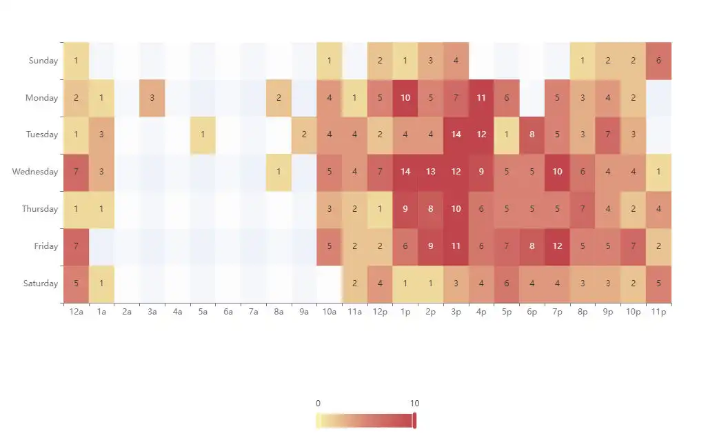
New video of the OPENHAB in a NUTSHELL series.
Let's go deeper in the CHARTS PAGE, after having introduced the main features in the previous video.
Let's see how to create aggregated charts to obtain values calculated according to the chosen unit of time, such as the daily average of photovoltaic production.
I also introduce the CALENDAR coordinate type to display the aggregated data in a CALENDAR-style page, using the HEATMAP chart type as an example.
Finally, I add to an existing graph all the secondary objects that OPENHAB makes available, to allow the user to zoom easily, change the chart type with a click and export the page as an image.
Enjoy your viewing
[Open on YOUTUBE]